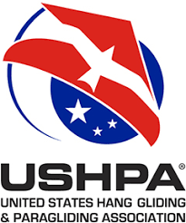
While an organization’s brand is much more than its graphic representation, the symbol of the organization, the logo, is an important element for communicating the essence of the association and the spirit of freedom that can only be experienced by flying.
The design directly expresses both hang gliding and paragliding with sufficiently realistic-looking wings. The gracefully included bird acknowledges that our sports are the closest approximation of bird-like flight available to mankind. The logo's asymmetry creates motion, an upward-sweeping movement that evokes a glider in a turn. And it's noted American color scheme honors the country from where mankind first learned to fly.
These visual and emotional impacts are immediate and intuitive. The logo is sophisticated without being complicated, and it is well-designed and executed. These qualities make it persistently interesting to look at. It's also effective in very small and very large sizes, and it will reproduce well in any print or digital medium.
In 2006, a process began to create a new logo, one that would embrace the USHPA of today. A logo committee was formed, and new designs were solicited from professionals, art students, members and non-members alike – in all, 147 submissions were received. The submitted designs were posted on the USHPA Web site, and members were encouraged to identify their favorite five designs in an on-line survey. A total of 616 members voiced their opinions, with the "favorite" design receiving 162 "votes" (26.3% of the "votes" cast); 124 designs received at least one "vote." With only 6.3% of our members expressing an opinion, and with so many designs being indicated as a favorite contender, the jury realized that members' opinions are as varied as the submitted designs.
The jury considered the submitted designs in the context of these stated objectives:
- Intuitively evoke the essence of the sport, even by those who don't know anything about the sport;
- be visually interesting, so no one gets tired of looking at it;
- display excellent design qualities, since people tend to associate well designed graphics with quality and integrity;
- reproduce well in many applications – large and very small, multi-color or one color, and printing by various processes including screen printing;
- be easy to recognize at a glance once you have seen it.
This design quickly rose to the top, standing out as the best candidate to fulfill that task and, in March 2007, was adopted as the official logo of the association.
About the artist
The Logo was designed by Andrew Allen. Born in Zimbabwe, Andrew, at age 21, moved to South Africa to study graphic design at Cape Town for a couple of years. Eventually, he ended up in Durban, which he describes as "a great surfer city", where he got a job and met his wife. Since 2001, Andrew has been living in England, just south of London with his wife and son.
Andrew labels himself as a keen road cyclist and mountain biker, and he loves the outdoors, "although it's a bit limited in soggy old England," he points out. He found out about the USHPA logo contest through a co-worker, Andy Hill, who is, "a keen paraglider pilot, a great guy and a little crazy too, but we don't hold it against him!"
Andrew says he's grateful for the opportunity to submit his logo and wishes USHPA members, "good luck in the future - and happy flying!"
What about the orange beach ball logo?
After the name change, it was determined that the Orange Ball logo, which had the strength of tradition and familiarity, nonetheless had a naive, homemade quality that suggested a small, perhaps unprofessional, organization. While some of our members believed that the old logo fulfilled the functions, it was decided that a well-designed new logo would very quickly become equally familiar, our membership would quickly learn to recognize it, and it would bring important advantages that an adjusted old logo could not.
Because paragliding now accounts for about half of the active membership it was determined that it should also be represented in the logo, as well as the name which was changed some time before.
The design panel felt that the orange ball is lacking in emotional impact for people who aren’t familiar with it. In addition, the design is not consistent with the styles and qualities familiar to today's youth – those we are hoping to attract to our sports.
Although it is no longer the official logo of the USHPA, our venerable Orange Ball will forever maintain a special place in the history of our organization.
Using the Logo
Please contact the office if you would like to use the logo in a project, so we can make sure to get you the correct file(s) and guidelines.